1 Theme Documentation
Thank you for purchasing our theme. This is one of the finest Shopify theme. Arnolt Fitness Sports Shopify Store is packed with a lot of powerful features. We have put together this documentation in the best possible way to explain these features and help you set up your website. Let's get Started!
All of your emails will be reviewed and checked carefully. However, based on the number support tickets and the nature of the request itself, the response time can be up to 1-2 business days.
Read the item documentation first
Many support queries and technical questions will already be answered in supporting documentation such as FAQ's and comments from previous buyers. We also make sure that all of the items sold on Envato Market have documentation included so always check the included information and if you can’t find the answer you’re looking for then consider whether the author might be able to help.
1.1About the Theme
This is a versatile and user-friendly Shopify theme. It gives you stylish page layouts and sections so you can easily design your attractive online store. You can use its intuitive Drag and Drop interface to create your unique Homepage. The specially designed Shop Page of This is ideal for showcasing your products in the most attractive way. Not just Homepage or Shop Page, you can use other inbuilt layouts for inner pages such as About, Contact, Services, Blog Page, FAQ Page in an equally attractive way. This makes it all easy.
If you need any assistance that are beyond the scope of this help file, kindly contact us through mail. Thank you so much!
Theme Customization
Our support covers getting setup with the theme, theme related questions and bugs or issues that occur when using the theme. Customization can be any work you need done to the theme that is not covered by the scope of our support.
In most cases, this is anything that falls outside of the options the theme offers. We work with an amazing customization team. They have unique offerings and can provide the services you need to customize your theme.
Note : if it's a minor customization means, we will do it for free. If any customization work takes more than 1 hour, we will charge $30/ per hour.
1.2 Shopify Information
To install this theme you must have a shopify store already. It can be trial store or premium one.
If you need help with understanding general details about shopify in Shopify. Below are all the useful links.
1.3 Theme Features
- Responsive design: Looks great on desktops, laptops, tablets and mobiles. Give it a try on your iPhone or iPad now.
- Draggable sections: Option to change the home page layout order using drag and drop option.
- Custom Content Block Option to showcase custom content with images.
- Ajax filters: Filter products by colors and other parameters using tags.
- Ajax Cart: An option to purchase the items without leaving current page.
- Ajax Wishlist: An option keep your items in wihlist.
- Highly customizable: Change colors, fonts, background image through the theme settings. No coding required.
- Multi-currency: The currecies AUD,CAD,USD,GBP,JPY,EUR,NZD,INR,PHP are inbuilt with theme
- Product sorting on collection pages: Sort by price, A to Z, newest etc.
- Great for SEO: Uses the latest Shopify SEO features and product data is formatted for Google rich snippet, so that product listings are optimized for search engines.
- Deal Timer: An option to setup deal timer to promo banners as well as for unique products.
- Newsletter: A pop-up and standard newsletter subscription form.
- Social sharing: Share by Twitter, Facebook, Google+ and Pinterest.
Getting Started
Getting up and running with theme is quick and easy. Simply create a Shopify account, purchase the theme and upload it. You'll then have the opportunity to customize it to your liking before publishing it as your main theme.If that sounds like a lot, don't worry… each step is outlined in detail below and it's entirely possible to go from scratch to a store running Boutique in under ten minutes!
If you already have a Shopify account, then you can skip ahead to the next section. If you're considering setting up a store but haven't done so yet, read on.
Shopify is a hosted eCommerce solution that allows you to set up and run your own online store. Pick an eCommerce website template (preferably from us!), list your products, accept credit card orders, and ship your goods — all with a few clicks of the mouse. With Shopify it's easy to sell online and there's no software to download or maintain.
Below is a full list of everything that is included when you download the main files, along with a brief description of each item.
Please unpack the whole package after downloading it from Themeforest. On that extracted themeforest-arnolt-shopify-theme,You can find files like Documentation, arnolt-demo01.zip, arnolt-demo02.zip to arnolt-demo05.zip, Log.txt and Readme.txt. You need to install the file "arnolt-demo01.zip, arnolt-demo02.zip to arnolt-demo05.zip".
- Diffrent demo packages included in this package. i.e arnolt-demo01.zip, arnolt-demo02.zip to arnolt-demo05.zip – This is the installable theme files you’ll need to install or upload. You can select any demo.
- Log.txt – this file contains theme change/update log.
- Readne.txt – this file contains details about folder structure.

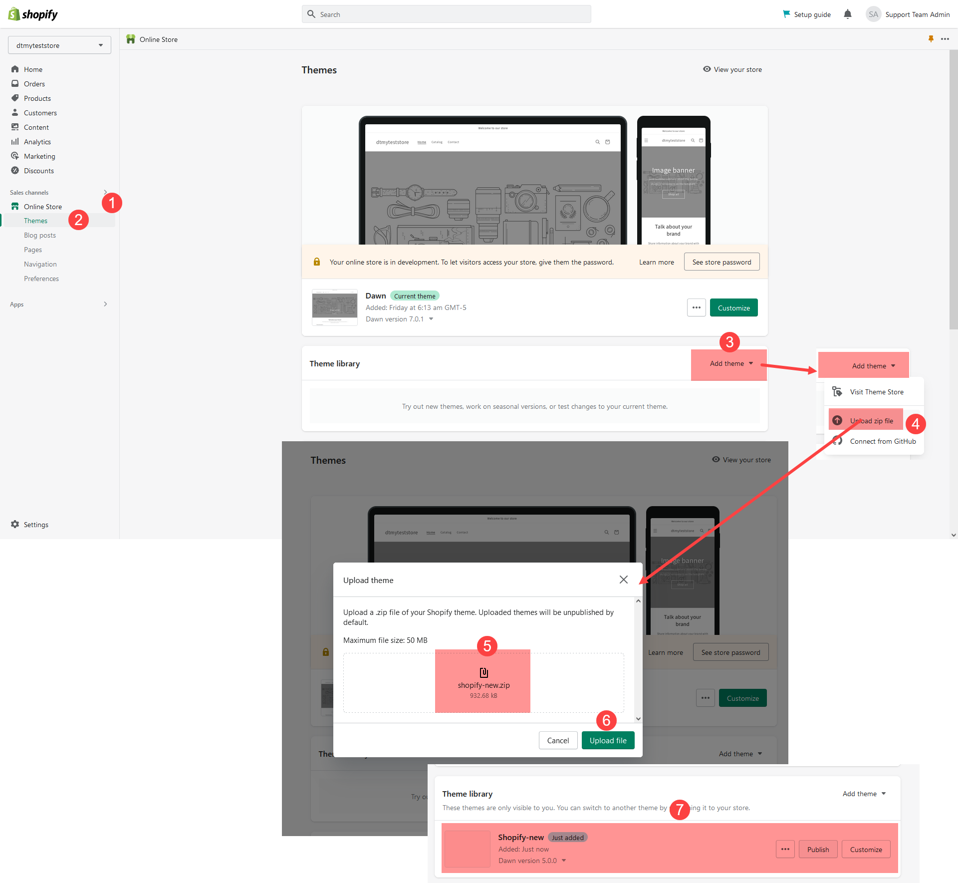
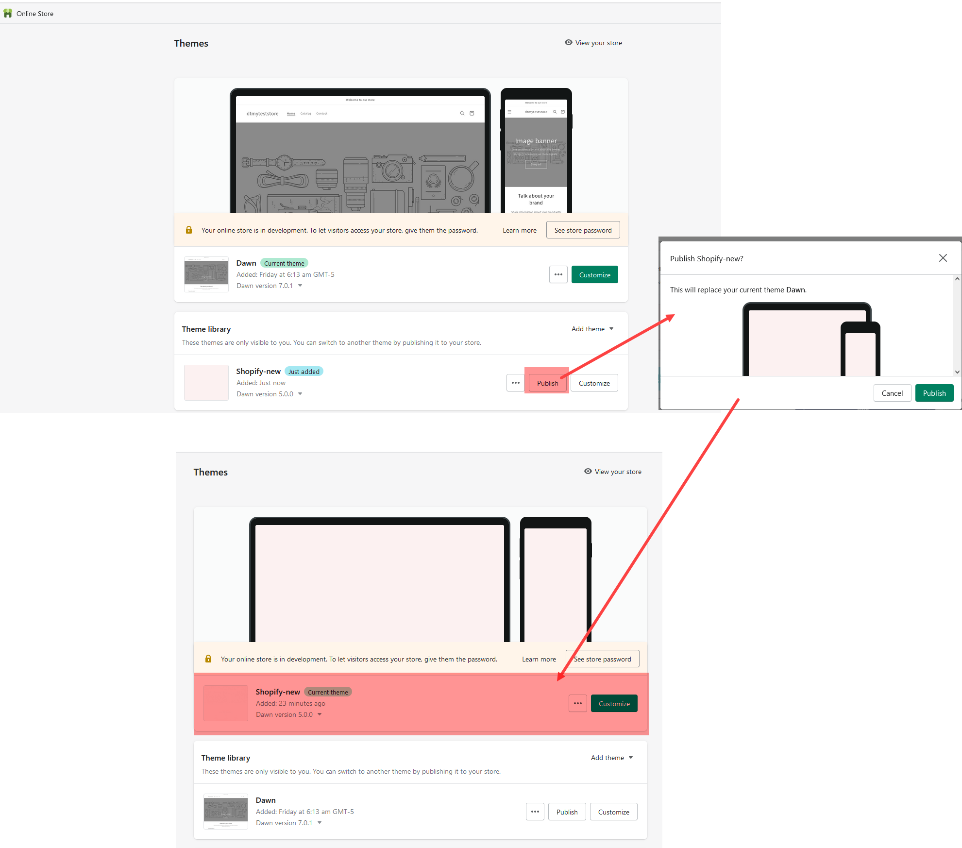
2Theme Installation
Installing Theme is easy and quick.To install the theme, please log in to your Shopify store and go to the Themes. From there, follow the instruction below:
1.In your back office go to: Online Store > Themes
2. Click Import option.
3. Select arnolt.zip file from extracted folder.
4. Once this files is loaded , just publish theme and do further setups.
Note : We advise reading and familiarizing yourself with the Shopify Manual. It is an extremely well written and thorough guide to understand the Shopify platform, written by Shopify themselves. It will help you understand many aspects of customization for your theme as well as using Shopify in general.
2.2 Plugin/App Installation
Once you have uploaded and activated the theme, install and activate few other free apps/plugins as follows.
Step 1 : Log in to the Shopify App Store.
Step 2 : Find an app that you want to install, and then click it.
Step 3 : On the app listing page, click Add app.
Step 4 : In your Shopify admin, to authorize the use of the app, click Install app.
Note : After the app is installed, you can view and use it from the Apps page in your Shopify admin.
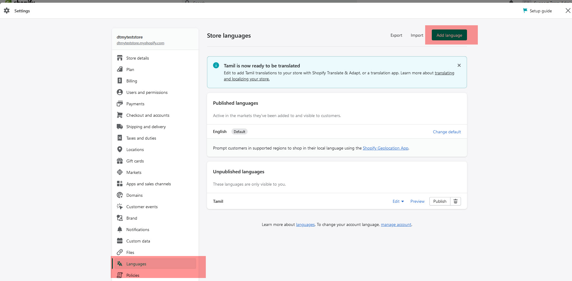
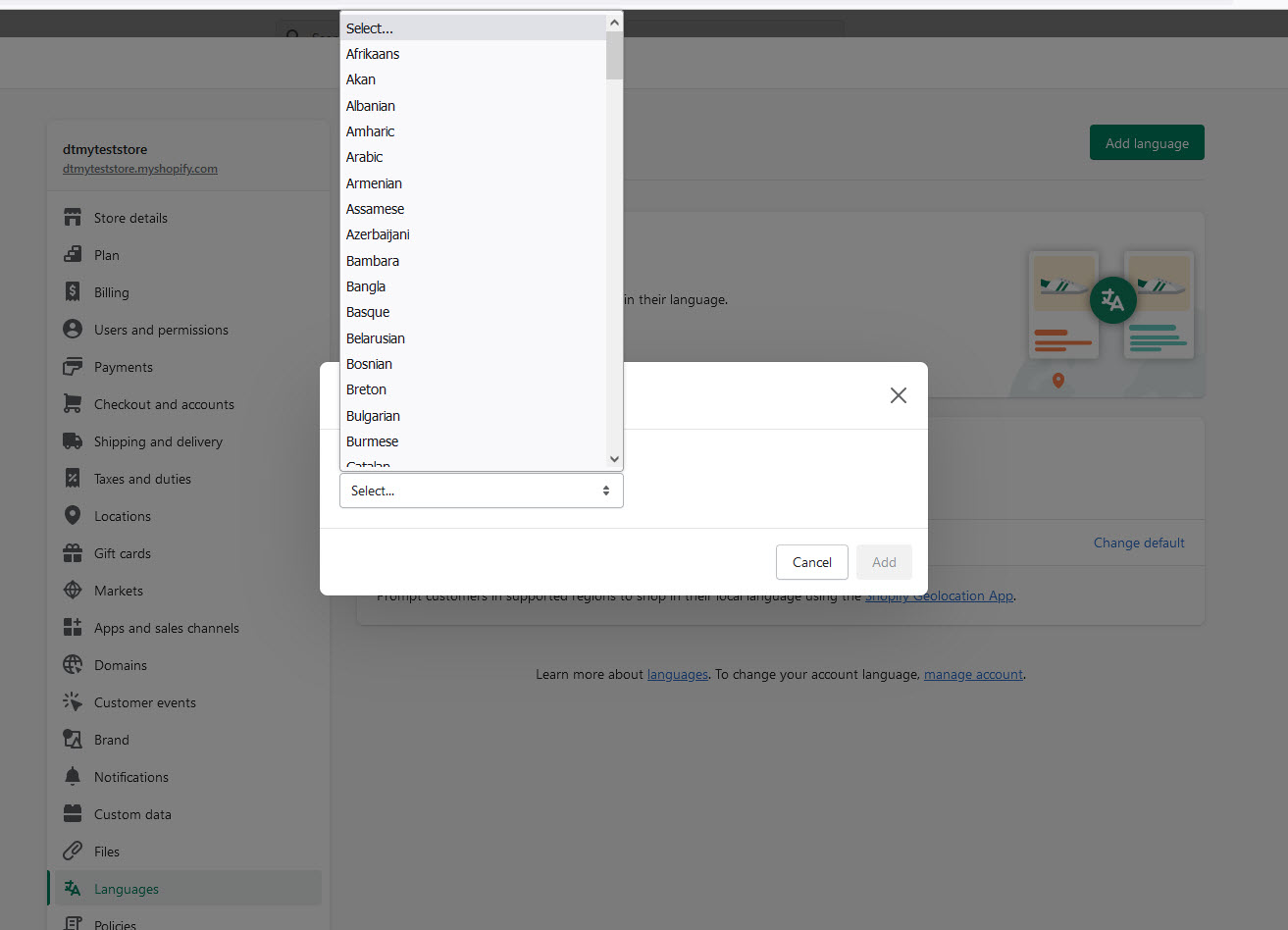
2.3Choose a language for your theme
Step 1 : From your Shopify admin, go to Online Store > Themes > Settings
Step 2 : Store languages > Add language
Step 3 :Language: Choose a language.
Step 4 :Click Save.
Using the language editor, enter translations for your theme text. Your changes are saved automatically.
To make sure that you have created complete translations for all of your theme's text content, you can search for incomplete translations.
3 Header layout
In order to manage general header setting, navigate to Online Store > Themes and click Customize button at the top right corner.
Header Settings
In this section, you can select your Header Position, Header Layout, and Header width settings. Depending on the options you select here, their respective dependent options will load and appear.
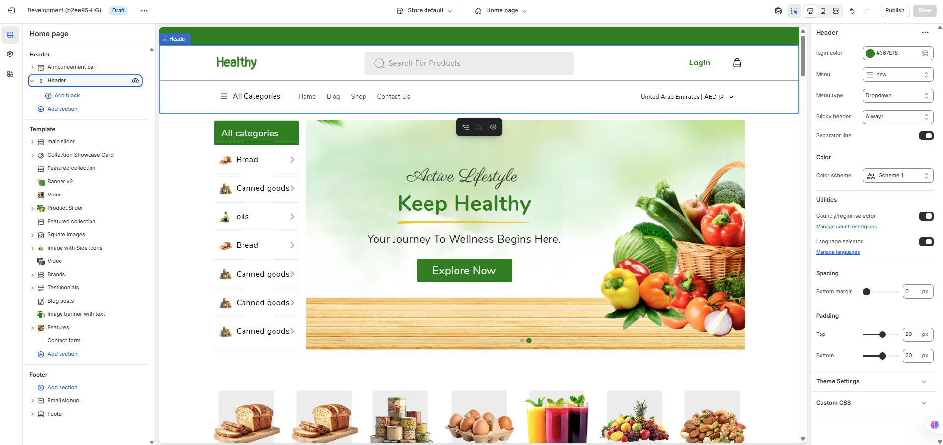
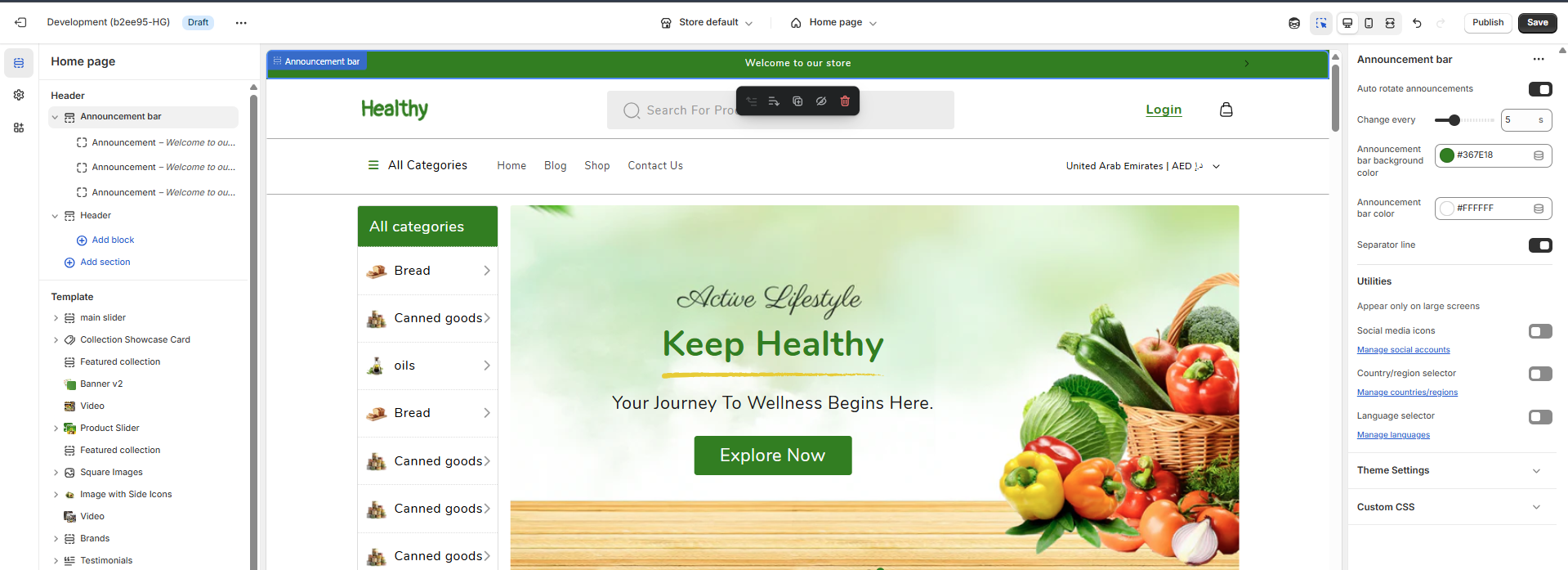
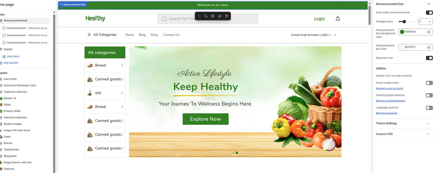
Announcement Settings
In this section, you can set your Announcement settings.
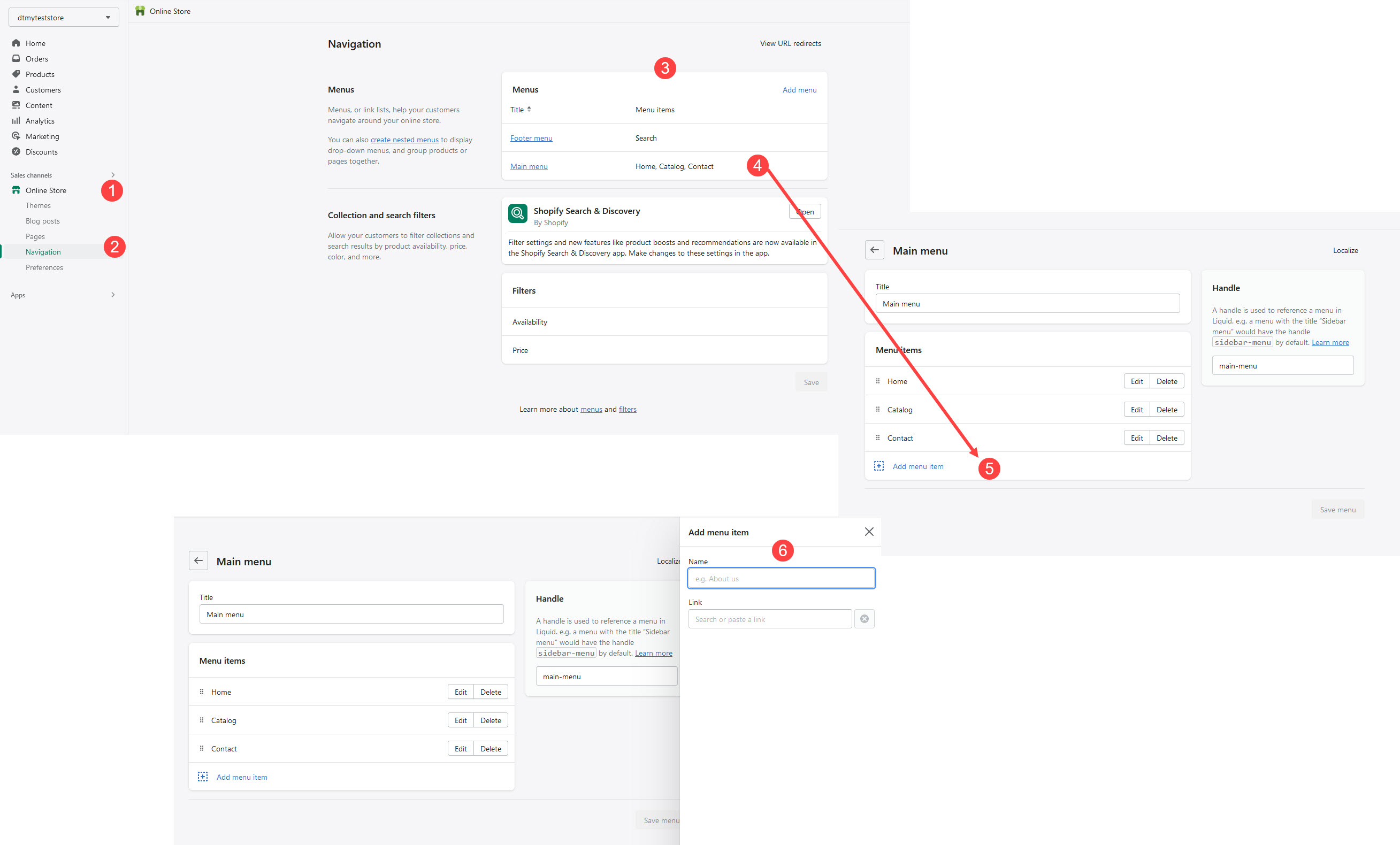
6Setup Pages
When you first install theme , it won’t contain all the extra pages setup by default that you might have seen in the live demo. For that you need to do followings setup for respective pages.
Step 1 : Go to Online Store > Pages
Step 2 : Click Add page
Step 3 : Enter a title for the page
Go to Customizer > Pages
You can add, remove, edit, and customize sections using the theme editor
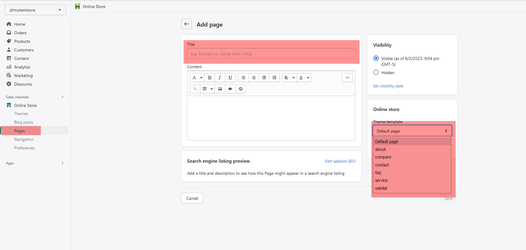
About us page
Step 1 : Go to Online Store > Pages
Step 2 : Click Add page
Step 3 : Enter a title for the page
Step 4 : Select 'about' in the Online store section, from the Theme template drop-down menu
Step 4 : Go to Customizer > Pages > About
Step 6 : You can add, remove, edit, and customize sections using the theme editor
Contact Page
Step 1 : Go to Online Store > Pages
Step 2 : Click Add page
Step 3 : Enter a title for the page
Step 4 : Select 'Contact' in the Online store section, from the Theme template drop-down menu
Step 4 : Go to Customizer > Pages > Contact Page
Step 6 : You can add, remove, edit, and customize sections using the theme editor
Service Page
Step 1 : Go to Online Store > Pages
Step 2 : Click Add page
Step 3 : Enter a title for the page
Step 4 : Select 'Service Page' in the Online store section, from the Theme template drop-down menu
Step 4 : Go to Customizer > Pages > Service Page
Step 6 : You can add, remove, edit, and customize sections using the theme editor
Wishlist Page
Step 1 : Go to Online Store > Pages
Step 2 : Click Add page
Step 3 : Enter a title for the page
Step 4 : Select 'Wishlist Page' in the Online store section, from the Theme template drop-down menu
Step 4 : Go to Customizer > Pages > Wishlist Page
Step 6 : You can add, remove, edit, and customize sections using the theme editor
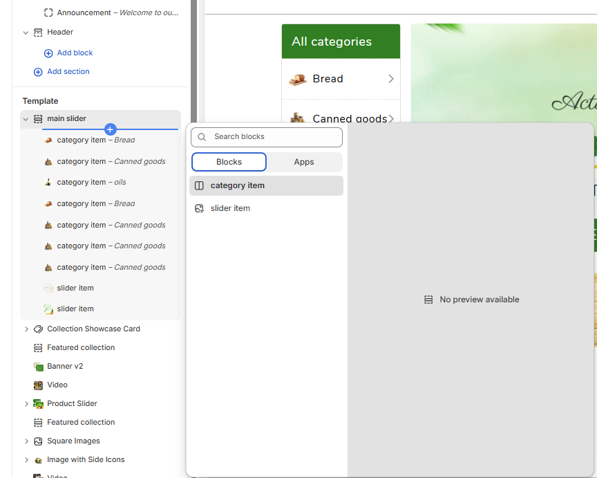
7 Sliders
You can change all the content, image , text color, links and button bg of slider banner in the "Slider" section itself.
Step 1: Log in to your Admin Dashboard.
Step 2: Go to Online Store > Themes > Live Theme > Customize.
Step 3: In the left sidebar, scroll to Sections and select main slider.
Step 4: Click the (+) button to add a new block to the main slider.
Step 5: Choose between slider item (to add a slide image) or category item (to display a product category like Bread or Canned Goods).
Step 6: After selecting the block, fill in the required details such as image, title, and link.
Step 7: Once you finish editing, click “Save” to apply your changes.
Note: You may not see a preview until all fields are filled in or the page is refreshed.
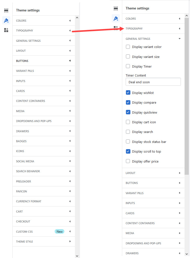
8 Theme settings
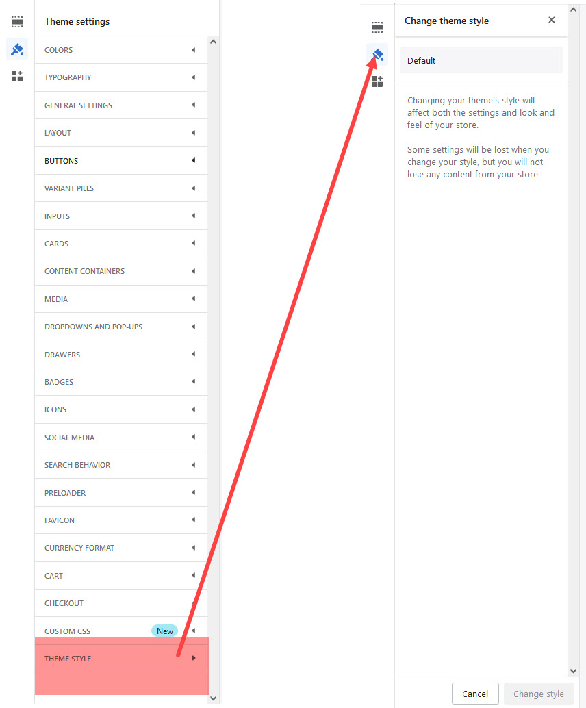
A theme style is a collection of settings chosen by the theme designer that you can apply to your store to give it a polished look and feel. All themes have a theme style applied by default. When you customize a theme, you replace the theme style settings with your own. If you apply a theme style to your theme, then your current settings, such as colors and typography, will change.
Step 1 : From your Shopify admin, go to Online Store > Themes.
Step 2 : Find the theme that you want to edit and click Customize.
Step 3 : Click Theme settings.
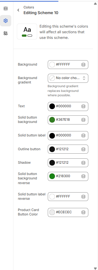
8.1 Colors
The Favicon Options are located in the Go to Online Store > Themes > Customize > Click Theme settings > Colors section.
Use these color pickers to set the primary colors and Secondary colors throughout the theme. At times we will use your selections to automatically generate variations by blending your colors. Additionally, some sections give you the option to manually set colors that overwrite these defaults.
- Text – Sets the color for general text across the site.
- Title – Used for headings and section titles throughout the layout.
- Background – Main background color of the website.
- Content Box Background – Applies to areas like the "Add to Cart" box and side sections (e.g. collection/blog sidebars).
- Accent – Main highlight color used in buttons, links, and interactive elements.
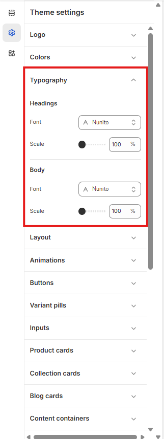
8.2 Typography
Choose from a huge selection of free fonts from Shopify's font library for the body (primary text), headings (titles) and navigation (header menu, buttons and small UI based text).
It's recommended that you use system fonts in your store. Using system fonts avoids downloading new fonts to your customer's computer, which can negatively impact your store load speed. The font that displays on your customer's computer depends on their operating system.
- Heading Font Family — choose a font family for the heading;
- Body Font Family — choose a font family for the body;
8.3 General settings
The Product pages section is the main customizable section for product pages. You can customize this section
Position - Choose the location of the product description relative to the product image.
Show a tab next to your product description - Display the content of a page, such as a size chart or a return policy, on a second tab. Select the page to display in Tab content.
8.4 Styles
Shopify product badges will make your products stand out from the market of other products in the search results that customers find. With millions of Shopify stores operating at the same time, you need something different that will catch customers’ attention fast so they won’t keep scrolling.
Badges are a short and effective way of promoting the specialty of your products and drive customers’ focus just by skimming through product pages. Without having to say too many words that customers sometimes don’t bother reading, you just need to point out the most interesting point that you want to show.
Sale badge color scheme: To change the color of the Sale Badge on theme.
Sold out badge color scheme : To change the color of the Sold out badge on theme.
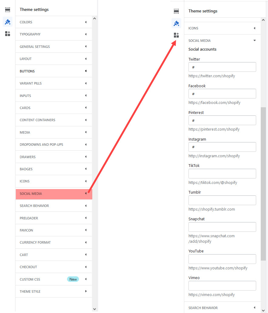
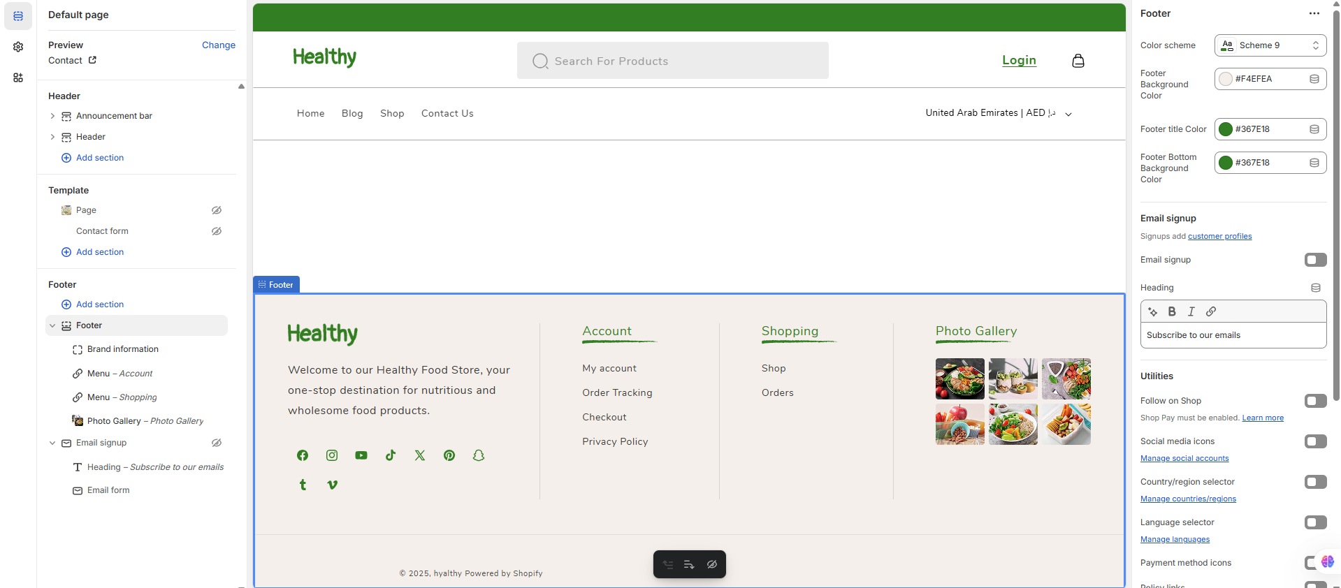
8.5 Social media
Theme includes a wide range of social media icons that can be used in several locations on your site. All social media icons are CSS based font icons, which ensures that they are high quality, and can be configured using the available options.
To Change theme Social media : Go to Online Store > Themes > Customize > Click Theme settings > Social media section.
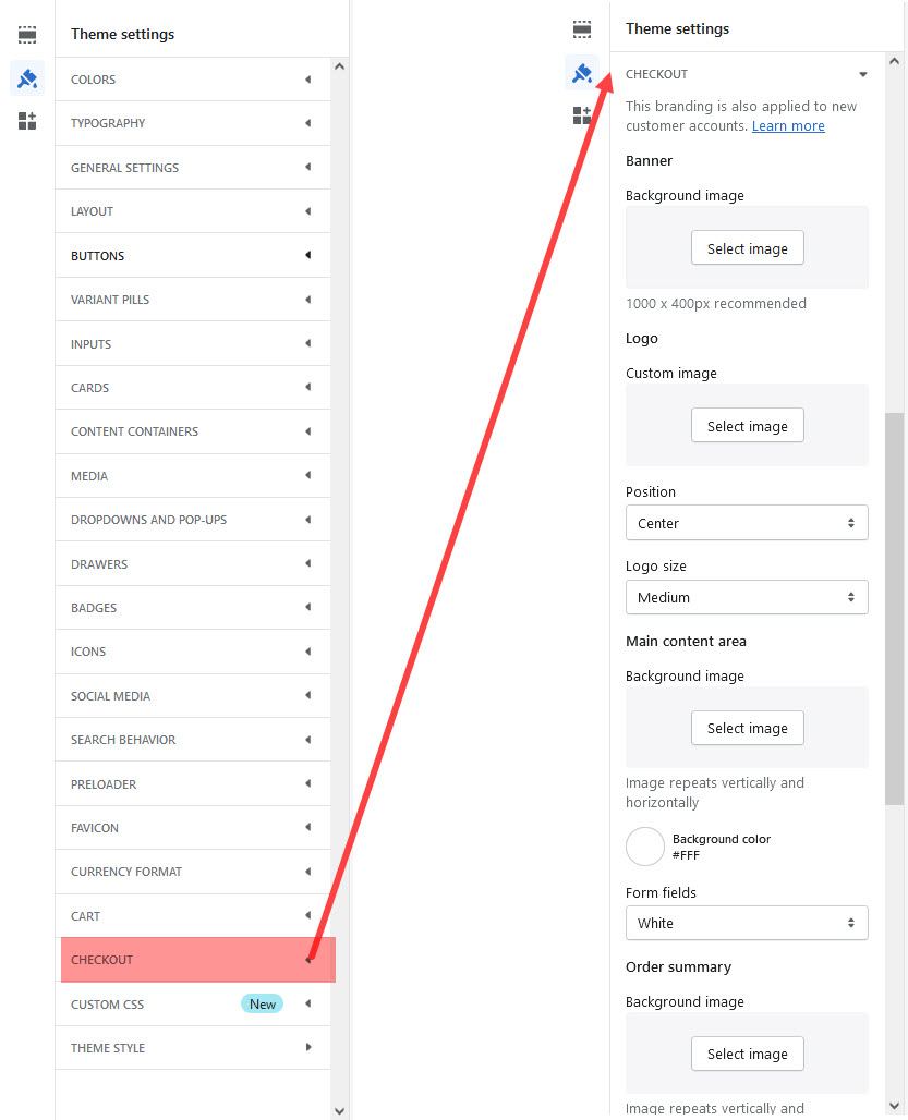
8.6 Checkout
Quick Shop allows your customers to search and order the products quickly without navigating to all categories to find products.
Enabling the 'Quick Shop' for your products allows customers to easily and quickly add a product to their cart without having to leave the page! If you enable the 'Quick Shop' an option will show up when you hover over product thumbnails in Collections.
You can enable the 'Quick Shop' within the theme settings! From your Shopify Admin, head into Customize > Theme Settings > Quick Shop. Enable quick shop' setting:
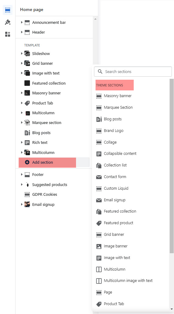
9 Home Page Sections
The sections are made global in Online Store 2.0. Therefore, not only the homepage, if you want to customize your product page, blog page, collection page, or any page, you can easily do that. Using metafields, Shopify makes it easy for you to manage your content.
Sections allows user to easily add or move content on their homepage with just a few clicks. You can preview your changes in real-time in either desktop or mobile view
There are 25+ sections available to use.Total 18 sections available on home page any time you can add, update, reorder and delete any section
Home page options can be easily configurable via these settings.
Settings of Themes --> Customize -> Sections -> Add Section:
9.1 Slideshow
You can change all the content, image , text color, links and button bg of slider banner in the "Slider" section itself.
Step 1: Log in to your Admin Dashboard.
Step 2: Go to Online Store > Themes > Live Theme > Customize.
Step 3: In the left sidebar, scroll to Sections and select main slider.
Step 4: Click the (+) button to add a new block to the main slider.
Step 5: Choose between slider item (to add a slide image) or category item (to display a product category like Bread or Canned Goods).
Step 6: After selecting the block, fill in the required details such as image, title, and link.
Step 7: Once you finish editing, click “Save” to apply your changes.
Note: You may not see a preview until all fields are filled in or the page is refreshed.
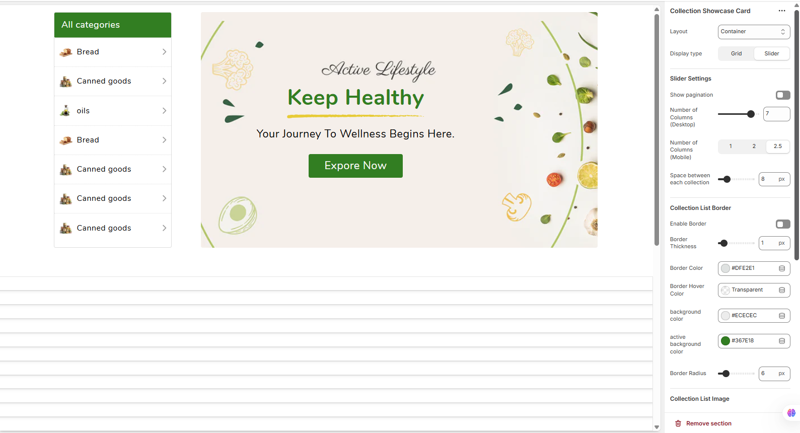
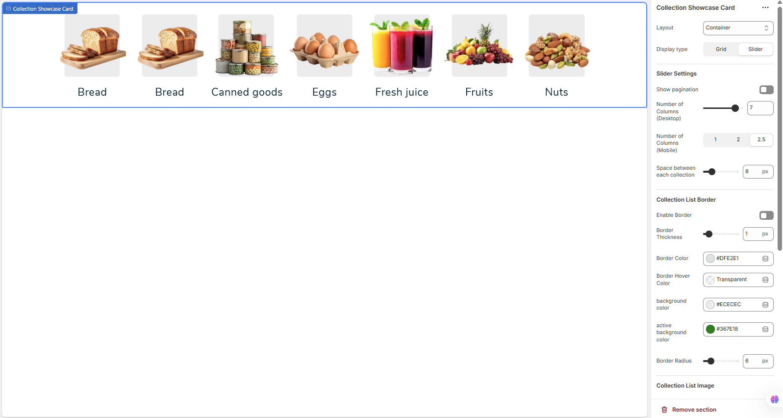
9.2Collection Showcase Card
The Collection Showcase Card section is designed to display a series of collections in a clean, card-based layout. This is an excellent way to guide customers to different product categories directly from your homepage or other pages. You can add multiple collections, and each will be represented by its featured image and title.
Section Settings Explained
To configure this section, navigate to it in the theme customizer. Below is a breakdown of all available settings.
Layout & Display
-
Layout: Controls the width of the section. 'Container' keeps the content within a standard page width, while 'Full Width' would stretch it to the edges of the screen.
-
Display type: Choose the presentation style for your collections:
- Grid: Displays all collections in a static, uniform grid.
- Slider: Presents the collections in an interactive, swipeable carousel.
Slider Settings
Note: These settings are only active when 'Display type' is set to 'Slider'.
-
Show pagination: Enable this to display navigation dots or arrows, helping users navigate through the slides.
-
Number of Columns (Desktop): Sets the maximum number of collection cards visible at once on larger screens.
-
Number of Columns (Mobile): Sets the number of cards visible on mobile devices. Using a fractional number like '2.5' shows a partial next card to encourage swiping.
-
Space between each collection: Adjusts the horizontal gap (in pixels) between each card.
Card Styling (Border & Background)
These settings control the visual appearance of the individual collection cards.
-
Enable Border: Adds a border around each collection card.
-
Border Thickness: Controls the thickness (in pixels) of the border if it's enabled.
-
Border Color: Sets the color of the card's border.
-
Border Hover Color: Sets the border color that appears when a user hovers their mouse over a card. Setting it to 'Transparent' can create a nice effect.
-
Background color: The default background color for each card.
-
Active background color: The background color of a card when it is considered 'active' or selected. This is often used to highlight the current collection a user is viewing.
-
Border Radius: Controls the roundness of the card's corners. A higher value results in more rounded corners.
Image Sizing
-
Image Width: Set a fixed width in pixels for the collection images. This helps maintain a uniform look.
-
Image Height: Set a fixed height in pixels for the collection images. Using the same value for width and height will result in square images.

9.3Featured collection
The Featured Collection section is designed to highlight a specific collection of products on any page. It's a perfect way to promote best-sellers, new arrivals, or sale items to grab your customers' attention.
Section Settings Explained
You can customize the appearance and content of this section using the following settings in the theme editor.
Collection & Product Settings
-
Collection: Use the dropdown menu to select the product collection you wish to feature in this section.
-
Product count: Use the slider to set the maximum number of products to display from the selected collection.
Text
-
Heading: The main title for the section (e.g., "Our Best Sellers"). This is a rich text field, allowing for bold and italic styling.
-
Heading size: Controls the font size of the main title (e.g., Small, Medium, Large).
-
Description: A rich text field where you can add a short introductory text below the heading.
-
Show collection description from admin: If you enable this toggle, it will override the manual "Description" field and instead display the description saved on the collection's page in your Shopify admin.
-
Description style: Choose a style for the description text, such as 'Body' or 'Subtitle', to control its appearance.
Collection Layout
-
Columns: Sets the number of product cards displayed in a single row on desktop screens.
-
Carousel: Enable this to display the products in an interactive, swipeable slider instead of a static grid.
-
Full width products: When enabled, this removes the side padding around the product grid, making it span the entire width of the section.
-
"View all" button: Enable this to show a button that links to the full collection page. This button will only appear if the number of products in your collection is greater than the "Product count" you have set.
-
"View all" style: Choose the design of the "View all" button, such as 'Solid button' or 'Outline button'.
Styling
-
Color scheme: Applies a pre-defined color palette (for background and text) to the section. You can manage these schemes in your main Theme settings > Colors.
-
Note: The style of the individual product cards (background color, borders, etc.) is typically controlled by global settings under Theme settings > Product cards.
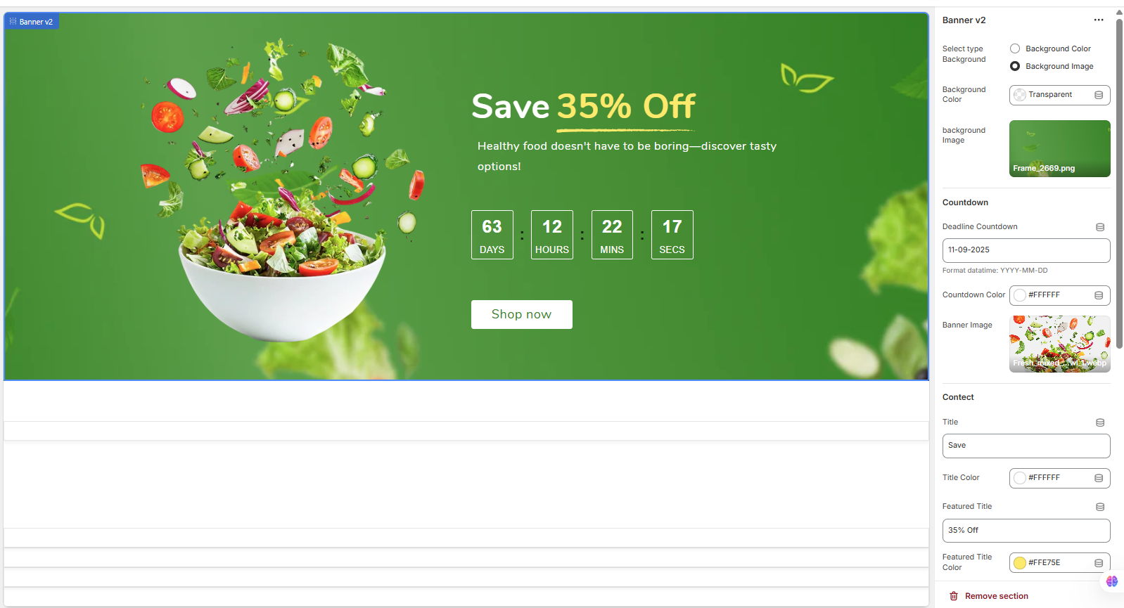
9.4Banner v2
The Banner v2 section is a highly customizable hero banner designed to capture visitor attention with dynamic content. It's perfect for announcing sales, special offers, or new arrivals, and features a prominent countdown timer.
Section Settings Explained
Below is a detailed breakdown of every setting available to create your perfect promotional banner.
Background
-
Select type: Choose whether the banner's background will be a solid color or an image.
- Background Color: A simple color fill.
- Background Image: Uses an uploaded image as the background.
-
Background Color: Sets a solid color for the banner's background. This is used if 'Background Color' is selected as the type.
-
Background image: Upload an image to use as the banner's main background.
Countdown
-
Deadline Countdown: Set the end date for the countdown timer. The format must be YYYY-MM-DD. The timer will automatically calculate the remaining days, hours, minutes, and seconds.
-
Countdown Color: Sets the text color for the numbers and labels (DAYS, HOURS, etc.) in the countdown timer.
Banner Image
-
Banner Image: Upload an image that will be overlaid on top of the background. In the demo, this is the salad bowl image. This allows for creative, layered designs.
Content & Text
-
Title: The first line of the main heading. In the demo: "Save".
-
Title Color: Sets the color of the main title text.
-
Featured Title: A highlighted portion of the heading, often used for the discount. In the demo: "35% Off".
-
Featured Title Color: Sets the color of the featured title text.
-
Show Line Under Featured Title: A toggle to display a decorative line beneath the featured title for emphasis.
-
Line Color: Sets the color of the decorative line (if enabled).
-
Desc (Description): The main descriptive text or sub-headline for your promotion.
-
Description Color: Sets the color of the description text.
Button Settings
-
Button Name: The text that appears on the call-to-action button (e.g., "Shop now").
-
Button link: The destination URL for the button when a customer clicks it. You can link to a product, collection, page, or external site.
-
Button Text Color: Sets the color of the text inside the button.
-
Button Background Color: Sets the background color of the button.
Custom CSS
-
This field allows you to add your own custom CSS code to apply unique styles to this specific section. This is an advanced feature and should be used with caution.
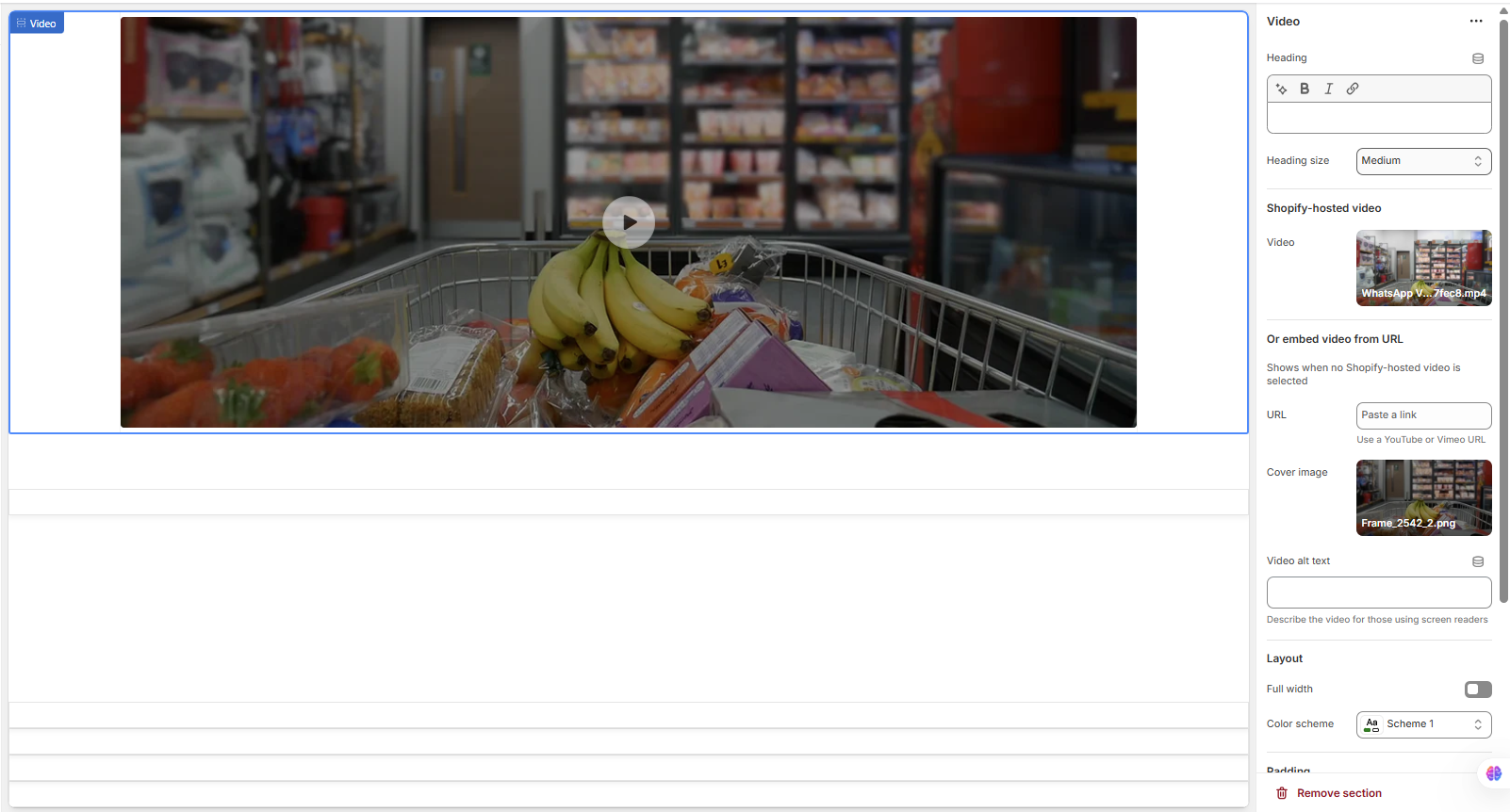
9.5Video
Go to Store Admin >> Online Store >> Customize >> Sections >>Video
The Video section allows you to embed a video directly onto your page. It's an excellent tool for brand storytelling, product demonstrations, or customer testimonials. You can use videos hosted directly on Shopify or embed them from popular platforms like YouTube and Vimeo.
Section Settings Explained
Customize the video player and its surrounding content using the following settings in the theme editor.
Heading
-
Heading: A rich text field for the section's main title, which appears above the video player. You can use bold and italic styling.
-
Heading size: Controls the font size of the heading (e.g., Small, Medium, Large).
Video Source
You have two options for adding your video. The theme will prioritize the Shopify-hosted video if one is selected.
-
Shopify-hosted video: Select a video file (e.g., .mp4) that you have uploaded to your Shopify store's content library (Admin > Content > Files).
-
Or embed video from URL: If you don't select a Shopify-hosted video, you can paste a direct URL here. This field supports links from YouTube or Vimeo.
Appearance & Accessibility
-
Cover image: Upload a high-quality image to serve as a thumbnail or poster for the video. This image is displayed before the user clicks the play button and can help improve page load times and visual appeal.
-
Video alt text: Provide a brief text description of the video's content. This is crucial for accessibility, as it will be read by screen readers for visually impaired users.
Layout & Styling
-
Full width: Enable this toggle to make the video section span the entire width of the browser window, removing any side container margins.
-
Color scheme: Applies a pre-defined color palette to the section's background and heading text. These schemes are managed in your main Theme settings > Colors.
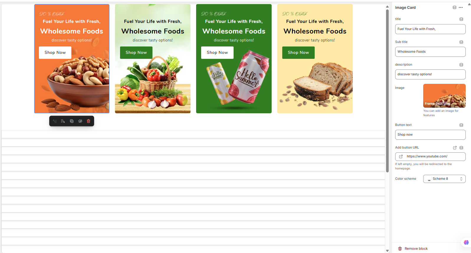
9.6Square Images
The Image Cards section allows you to display a visually appealing grid of promotional cards. This section is block-based, meaning you build the content by adding and customizing individual "Image Card" blocks. It's perfect for highlighting different collections, promotions, or key features of your store side-by-side.
How to Use
To populate this section, click "Add block" in the theme editor sidebar and select "Image Card". You can add multiple cards, and each can be customized independently. You can also drag and drop the blocks to reorder them.
Image Card Block Settings
The following settings are available for each "Image Card" block you add:
-
Title: The primary heading text for the card (e.g., "Fuel Your Life with Fresh,").
-
Sub title: The secondary heading, which often appears in a different style or weight (e.g., "Wholesome Foods").
-
Description: A short, descriptive line of text to add more context (e.g., "discover tasty options!").
-
Image: Upload the primary image for the card. This image often serves as the background or main visual element.
-
Button text: The text that will appear on the call-to-action button (e.g., "Shop now").
-
Add button URL: Set the link that the button will lead to. You can link to a product, collection, or any other page. Note: As stated in the settings, if this field is left empty, the button may redirect to the homepage by default.
-
Color scheme: Select a pre-defined color palette for this specific card. This powerful feature allows each card to have a unique background and text color combination, creating a dynamic and varied look. These color schemes are managed globally in your Theme settings > Colors.
9.7Image with Side Icons
Go to Store Admin >> Online Store >> Customize >> Sections >> Image with Side Icons
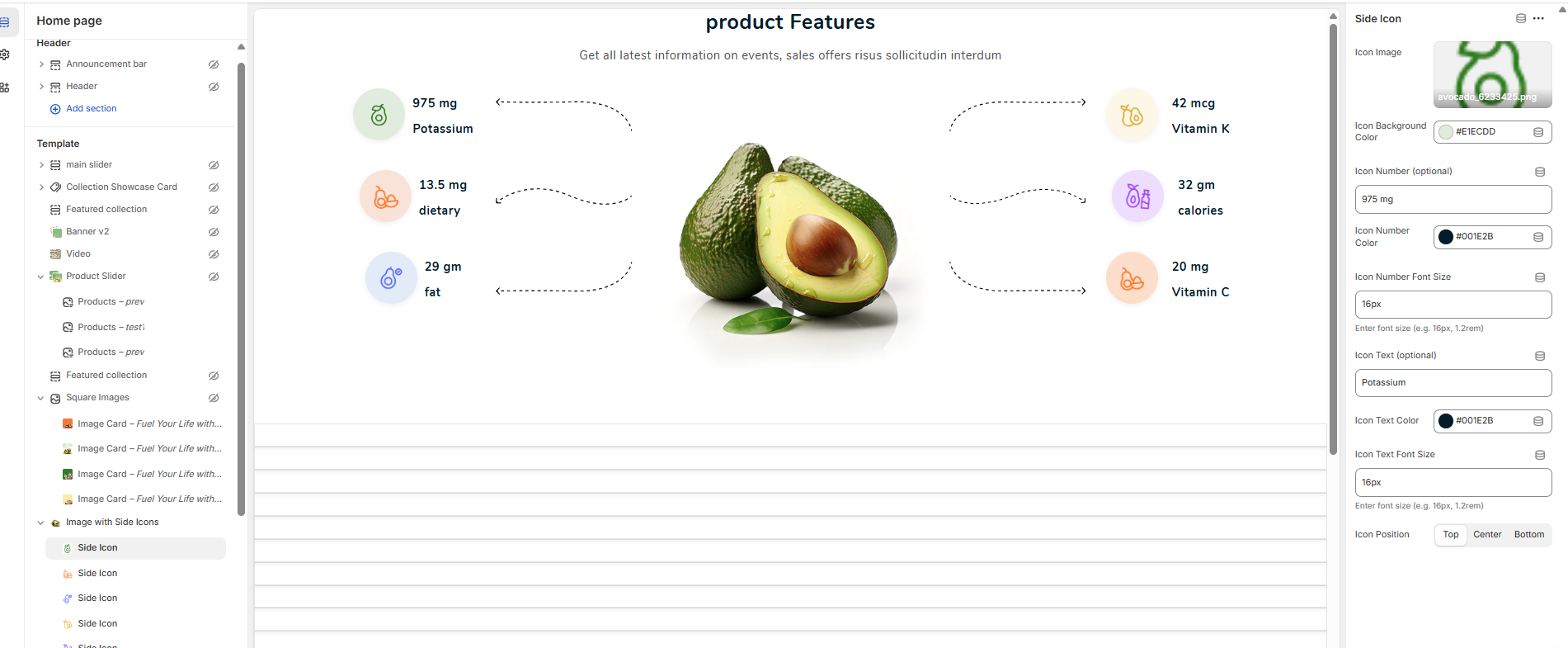
The "Image with Side Icons" section is designed to showcase product features or key information in a visually appealing, infographic-style layout. It features a central image with multiple "Side Icon" blocks branching off from it, allowing you to highlight specific details or benefits.
Section vs. Block Settings
This section is built using two types of settings:
- Section Settings: These control the overall appearance, including the main title, description, central image, and background.
- Block Settings ("Side Icon"): These control each individual feature point, including its icon, values, and text.
Main Section Settings
These settings apply to the entire section container.
-
Main Title: The primary heading for the entire section (e.g., "Product Features").
-
Main Title Color: Sets the text color for the main title.
-
Main Title Font Size: Allows you to specify the exact font size for the title (e.g., "28px").
-
Description (optional): A text area for a short description or subheading that appears below the main title.
-
Main Description Color: Sets the text color for the description.
-
Main Description Font Size: Allows you to specify the font size for the description text.
-
Main Image: Upload the central image that all the feature icons will point to. In the demo, this is the avocado.
-
Background Image (optional): You can add a background image for the entire section.
-
Background Color (optional): Sets a solid background color for the section.
-
Custom CSS: A field for advanced users to add custom styling to this specific section.
Side Icon Block Settings
To add a feature point, click "Add Side icon" in the theme editor. You can add multiple blocks, and they will arrange themselves on the left and right of the main image. Each block has the following settings:
-
Icon Image: Upload a small image or icon for this specific feature.
-
Icon Background Color: Sets the color of the circular background behind the icon.
-
Icon Number (optional): The primary value or data point (e.g., "975 mg").
-
Icon Number Color: Sets the text color for the number/value.
-
Icon Number Font Size: Controls the font size of the number/value.
-
Icon Text (optional): The label or description for the data point (e.g., "Potassium").
-
Icon Text Color: Sets the text color for the label.
-
Icon Text Font Size: Controls the font size of the label.
-
Icon Position: This setting controls the vertical alignment of the icon on its respective side (Left or Right). Options are likely 'Top', 'Center', and 'Bottom'.
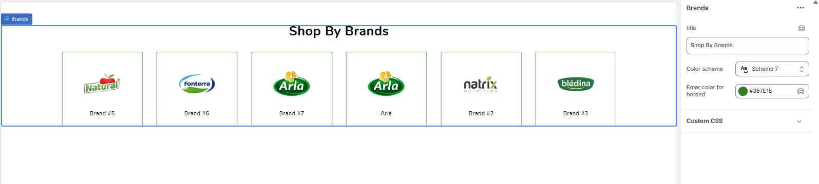
9.8Brand
Go to Store Admin >> Online Store >> Customize >> Sections >> Brand
The Brands section is designed to showcase the logos of the brands you carry. This helps build customer confidence and allows for easy navigation to brand-specific collections. The section is built using individual "brand" blocks that you can add and reorder as needed.
Main Section Settings
These settings control the overall appearance of the entire section.
-
Title: The main heading that appears above the grid of brand logos (e.g., "Shop By Brands").
-
Color scheme: Applies a pre-defined color palette (for the background and title text) to the section. These schemes are managed globally in your Theme settings > Colors.
-
Enter color for border: This color picker sets the color for the border that appears around each individual brand logo.
-
Custom CSS: A field for advanced users to add custom CSS code for unique styling adjustments to this specific section.
Brand Block Settings
To add a brand to the grid, click "Add brand" in the theme editor sidebar. Each brand block has the following settings:
-
Title: The name of the brand. This text is typically displayed below the logo image.
-
Image: Upload the official logo image for the brand here.
-
Add brand URL: Paste the link that customers will be taken to when they click on the brand logo. This should ideally be a link to a collection page filtered to show only products from that brand. Note: As stated in the settings, if this field is left empty, the link will default to the homepage.
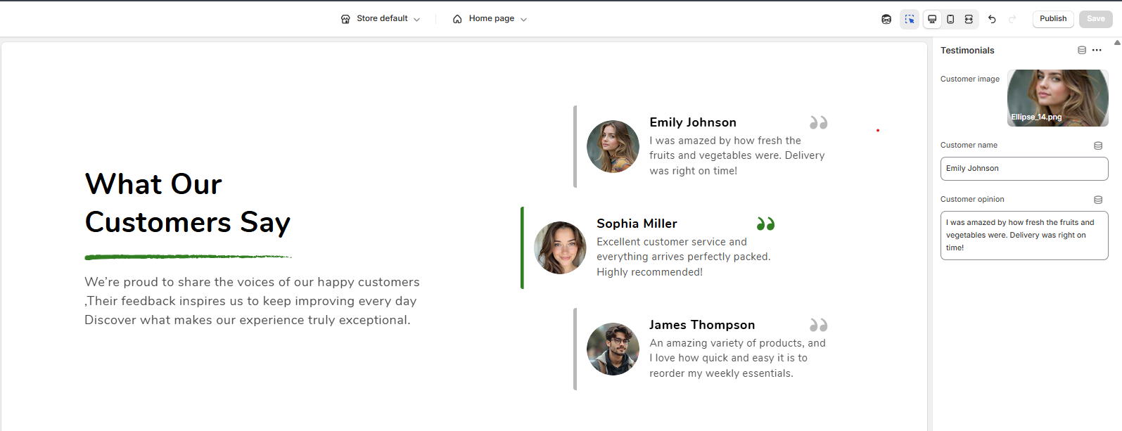
9.9Testimonials
Go to Store Admin >> Online Store >> Customize >> Sections >> Testimonials
The Testimonials section is designed to build trust and social proof by showcasing feedback from your happy customers. It features a clean layout with a main title area on one side and a list of customer reviews on the other. This section is block-based, allowing you to add multiple testimonials.
Main Section Settings
These settings control the overall appearance and the main text content of the section.
-
Section background color: Sets the background color for the entire section.
-
Section Title: The main heading for the section (e.g., "What Our Customers Say").
-
Section description: The introductory paragraph that appears below the main title, providing more context about your customer feedback.
-
Section Title Color: Sets the text color for the main title.
-
Section description Color: Sets the text color for the introductory paragraph.
-
Review active color: This color is used for the currently active or highlighted testimonial. It applies to accent elements like the vertical bar on the left and the quotation mark icon, indicating which review is currently in focus (especially if it functions as a slider).
-
Customer name Color: Sets the text color for all customer names in the list.
-
Customer opinion Color: Sets the text color for the actual review text (the customer's opinion).
-
Custom CSS: A field for advanced users to add custom CSS to apply unique styling to this section.
Testimonial Block Settings
To add a customer review, click "Add Testimonial" (or a similarly named block) in the theme editor. While the block settings are not fully shown, each testimonial block will logically have the following options:
-
Image: Upload a photo or avatar of the customer.
-
Customer Name: Enter the name of the person who provided the testimonial (e.g., "Sophia Miller").
-
Testimonial Text: Enter the actual quote or review from the customer.
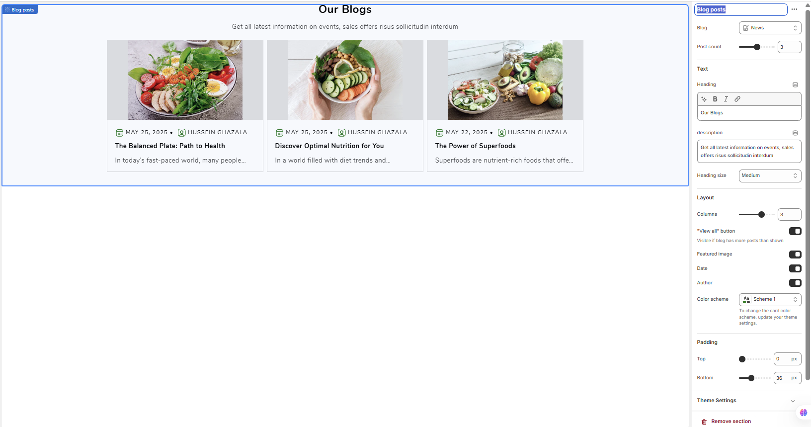
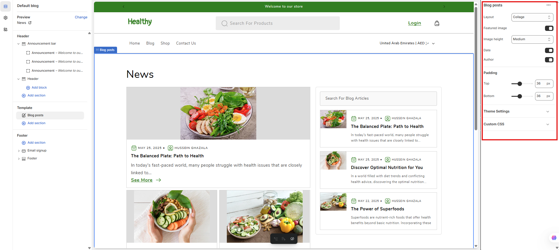
9.10Blog posts
Go to Store Admin >> Online Store >> Customize >> Sections >> Blog posts
The Blog posts section allows you to feature recent articles from one of your store's blogs. It's an excellent way to drive traffic to your content, showcase your brand's expertise, and keep your site looking fresh and updated.
Section Settings Explained
Customize which posts are shown and how they are displayed using the following settings.
Blog Source
-
Blog: Use the dropdown menu to select which of your store's blogs you want to pull articles from (e.g., "News").
-
Post count: Use the slider to set the maximum number of recent blog posts to display in the section.
Text & Heading
-
Heading: The main title for the section, which appears at the top (e.g., "Our Blogs"). This is a rich text field, allowing for bold and italic styling.
-
Description: A short introductory paragraph that appears below the heading.
-
Heading size: Controls the font size of the main heading (e.g., Small, Medium, Large).
Layout & Display
-
Columns: Sets the number of blog post cards that will appear in a single row on desktop screens.
-
"View all" button: Enable this to display a button that links to the full blog page. Note: This button will only be visible if the selected blog has more articles than the "Post count" you have set.
-
Featured image: A toggle to show or hide the main featured image for each blog post.
-
Date: A toggle to show or hide the publication date for each post.
-
Author: A toggle to show or hide the author's name for each post.
Styling & Spacing
-
Color scheme: Applies a pre-defined color palette to the section's background and heading text. Note: The style of the individual post cards (their background, text color, etc.) might be controlled by global settings, as suggested by the note "To change the card color scheme, update your theme settings."
-
Padding (Top / Bottom): These sliders control the amount of vertical empty space above (Top) and below (Bottom) the entire section, allowing you to adjust its spacing on the page.
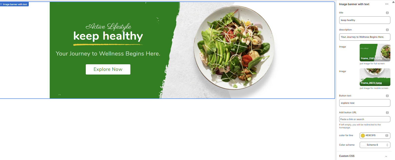
9.11Image banner with text
Go to Store Admin >> Online Store >> Customize >> Sections >>Image banner with text
The "Image banner with text" section is a versatile hero banner perfect for making a strong first impression. It allows you to combine compelling imagery with promotional text and a clear call-to-action. A key feature is the ability to use different images for desktop and mobile to ensure optimal display on all devices.
Section Settings Explained
Customize your banner using the following settings in the theme editor.
-
Title: The main, bold heading for the banner (e.g., "keep healthy").
-
Description: The secondary text or sub-headline that appears below the title to provide more context (e.g., "Your Journey to Wellness Begins Here.").
-
Image (Desktop): Upload the primary banner image that will be displayed on wider screens like desktops and tablets. The helper text suggests "put image for full screen."
-
Image (Mobile): Upload a separate, vertically-oriented image to be used specifically on mobile devices. This is a crucial feature to ensure your banner looks great and is not awkwardly cropped on smaller screens.
-
Button text: The text displayed on the call-to-action button (e.g., "explore now").
-
Add button URL: Set the link destination for the button. You can link to a product, collection, or any other page. Note: As stated in the settings, if this field is left empty, the button will redirect to the homepage by default.
-
Color for line: This color picker controls the color of the decorative line that appears under the main title, adding a visual highlight.
-
Color scheme: Select a pre-defined color palette. This scheme typically controls the colors of the text (title, description) and the button to ensure they have good contrast against the banner image. These schemes are managed globally in your Theme settings > Colors.
-
Custom CSS: A field for advanced users to add their own custom CSS code to apply unique styles to this specific section.
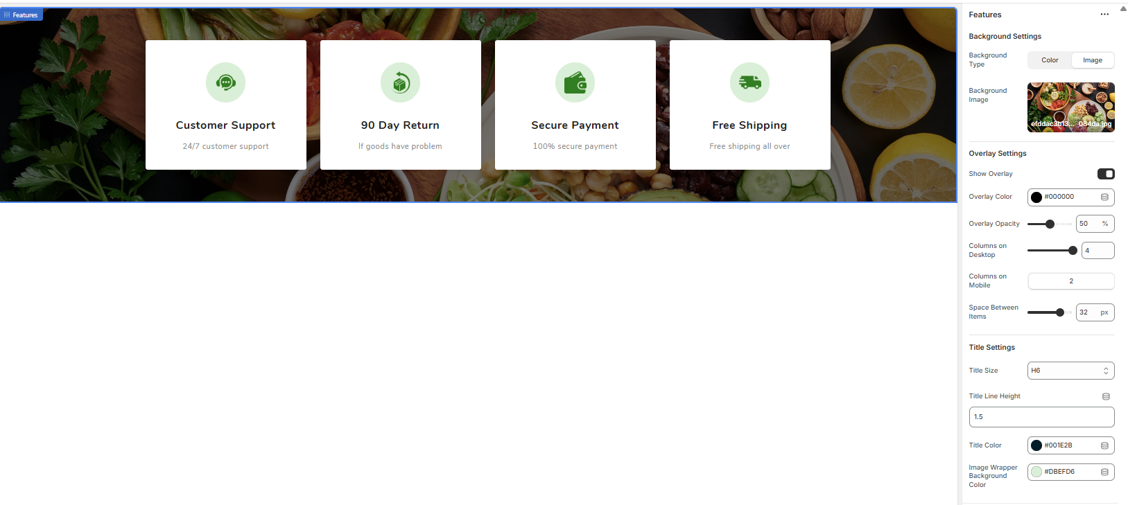
9.12Feature
Go to Store Admin >> Online Store >> Customize >> Sections >> Feature
The Features section is designed to highlight key benefits, services, or value propositions of your store (e.g., Free Shipping, Secure Payment). It displays these features in a clean, card-based grid that can be placed over a background image or a solid color, making it an effective tool for building customer trust.
Section vs. Block Settings
This section is composed of two parts:
- Main Section Settings: These options control the overall look of the section, including the background, overlay, layout, and styling for the text within the cards.
- Feature Block Settings: These options control the content of each individual card, such as its icon, title, and subtitle.
Main Section Settings
These settings apply to the entire section container.
- Background Type: Choose whether the section background is a solid 'Color' or an 'Image'.
- Background Image: Upload an image to serve as the background for the entire section.
- Show Overlay: A toggle to add a color layer on top of the background image, which can improve text readability.
- Overlay Color: Sets the color of the overlay layer.
- Overlay Opacity: Controls the transparency of the overlay color (e.g., 30%). A higher value makes the background less visible.
- Columns on Desktop: Sets the number of feature cards displayed in a single row on desktop screens.
- Columns on Mobile: Sets the number of feature cards displayed in a single row on mobile screens.
- Space Between Items: Controls the size of the gap (in pixels) between each feature card.
- Title Size: Select the heading style (e.g., H6) for the title text within each card.
- Title Line Height: Adjusts the vertical spacing for the title text.
- Title Color: Sets the color of the main title (e.g., "Customer Support") within each card.
- Image Wrapper Background Color: Sets the color of the circular background behind each feature's icon.
Feature Block Settings
To add a feature, click "Add Feature" in the theme editor. Each block has the following settings:
-
Image: Upload the icon or image that represents this specific feature (e.g., a shipping truck icon).
-
Title: The main heading for the feature card (e.g., "Free Shipping").
-
Subtitle: A short description that appears below the title (e.g., "Free shipping all over"). Note: There is a recommended maximum of 21 characters for best display.
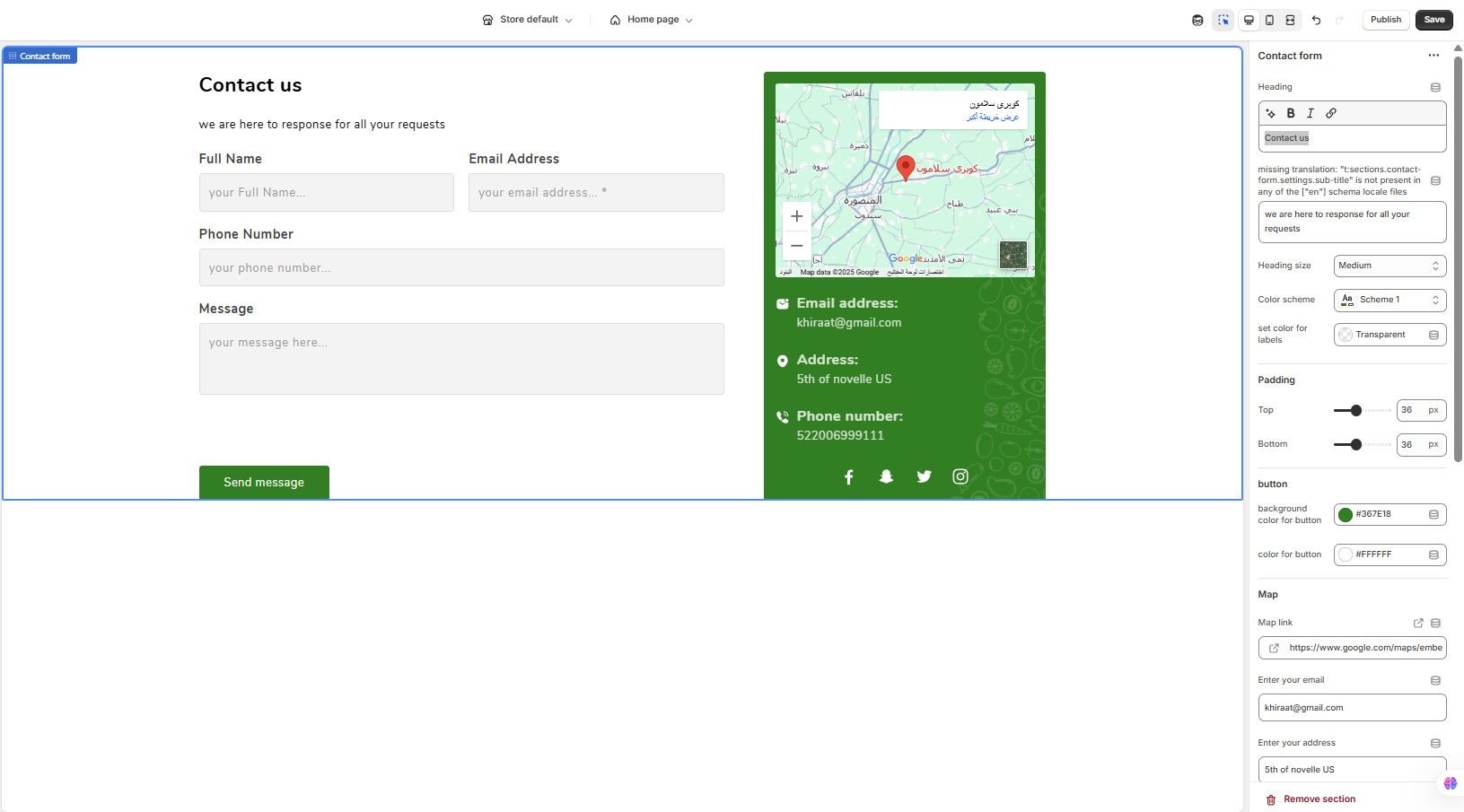
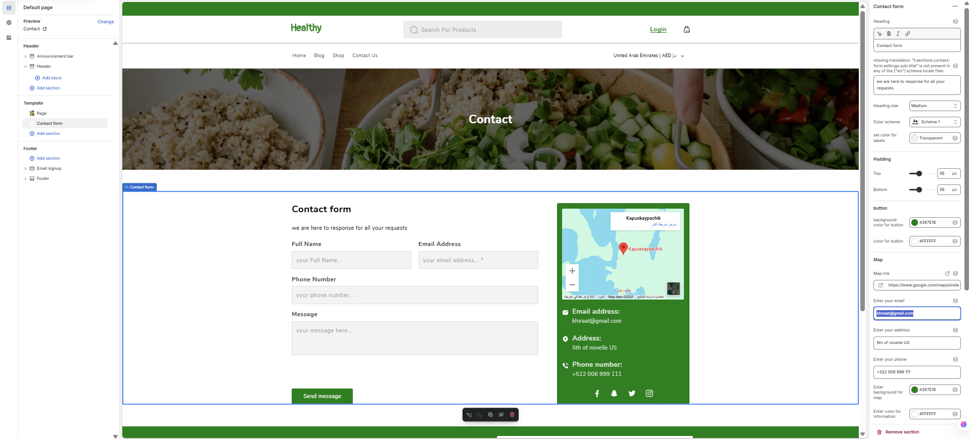
9.13Contact form
Go to Store Admin >> Online Store >> Customize >> Sections >>Contact form
The Contact Form section allows you to create a complete contact page. It includes an interactive submission form for customer inquiries and a dedicated information panel to display your address, contact details, social media links, and an embedded map of your location.
Section Settings Explained
Below is a detailed breakdown of every option available in the Contact Form settings.
General Settings
-
Heading: The main title of the section (e.g., "Contact us").
-
Sub-heading: The descriptive text that appears below the main title (e.g., "we are here to response for all your requests").
-
Heading size: Controls the font size of the main heading (e.g., Small, Medium, Large).
-
Color scheme: Applies a pre-defined color palette to the section. Note that specific color pickers below can override this scheme.
-
Set color for labels: Sets the text color for the form field labels (e.g., "Full Name", "Email Address").
Padding
-
Top / Bottom: These sliders control the amount of vertical empty space above (Top) and below (Bottom) the entire section.
General Settings
-
Heading: The main title for the contact form area (e.g., "Contact us").
-
Sub-heading / Description: A short text that appears below the heading to provide more context (e.g., "we are here to response for all your requests").
-
Heading size: Controls the font size of the main heading (Small, Medium, Large).
-
Color scheme: Applies a pre-defined color palette to the section's background and text.
-
Set color for labels: Sets the color for the form field labels ("Full Name", "Email Address", etc.). A 'Transparent' value will likely make it inherit the default text color from the chosen color scheme.
Padding & Button
-
Padding (Top / Bottom): Adjusts the vertical empty space above and below the section.
-
Background color for button: Sets the background color of the "Send message" button.
-
Color for button: Sets the color of the text inside the button.
Map & Information Box
These settings control the content and appearance of the sidebar containing your contact details.
-
Map link: Paste the "embed a map" iframe link from Google Maps here. The map will be displayed at the top of the information box.
-
Enter your email: Your business email address to be displayed.
-
Enter your address: Your physical business address.
-
Enter your phone: Your business phone number.
-
Enter background for map [box]: Sets a solid background color for the entire information box.
-
Enter color for information: Sets the text color for your email, address, and phone number within the box.
-
Enter your background image for map [box]: Upload an image to use as a background for the information box. This will likely override the solid background color if set.
Social Media Links
These fields allow you to add social media icons to the information box. Leave a field empty to hide its icon.
-
Enter your facebook link
-
Enter your twitter link
-
Enter your instagram link
-
Enter your snapchat link
Advanced
-
Custom CSS: A field for advanced users to add their own CSS code to apply unique Settings -->
Button
-
Background color for button: Sets the background color of the "Send message" button.
-
Color for button: Sets the color of the text written inside the button.
Map & Information Box
These settings control the content and appearance of the right-hand panel.
-
Map link: Paste your Google Maps embed iframe link here to display a map of your location.
-
Enter your email: The business email address to be displayed.
-
Enter your address: Your physical store or office address.
-
Enter your phone: The contact phone number for your business.
-
Enter background for map: Sets the background color for the entire information box.
-
Enter color for information: Sets the text color for your contact details (email, address, and phone).
-
Enter your background image for map: An optional field to upload a background image for the information box. This will be layered underneath the background color.
Social Media Links
These fields populate the social media icons at the bottom of the information box.
-
Enter your facebook link: URL for your Facebook page.
-
Enter your twitter link: URL for your Twitter profile.
-
Enter your instagram link: URL for your Instagram profile.
-
Enter your snapchat link: URL for your Snapchat profile.
Advanced
-
Custom CSS: A field for advanced users to add custom CSS to apply unique styling to this specific section.
-
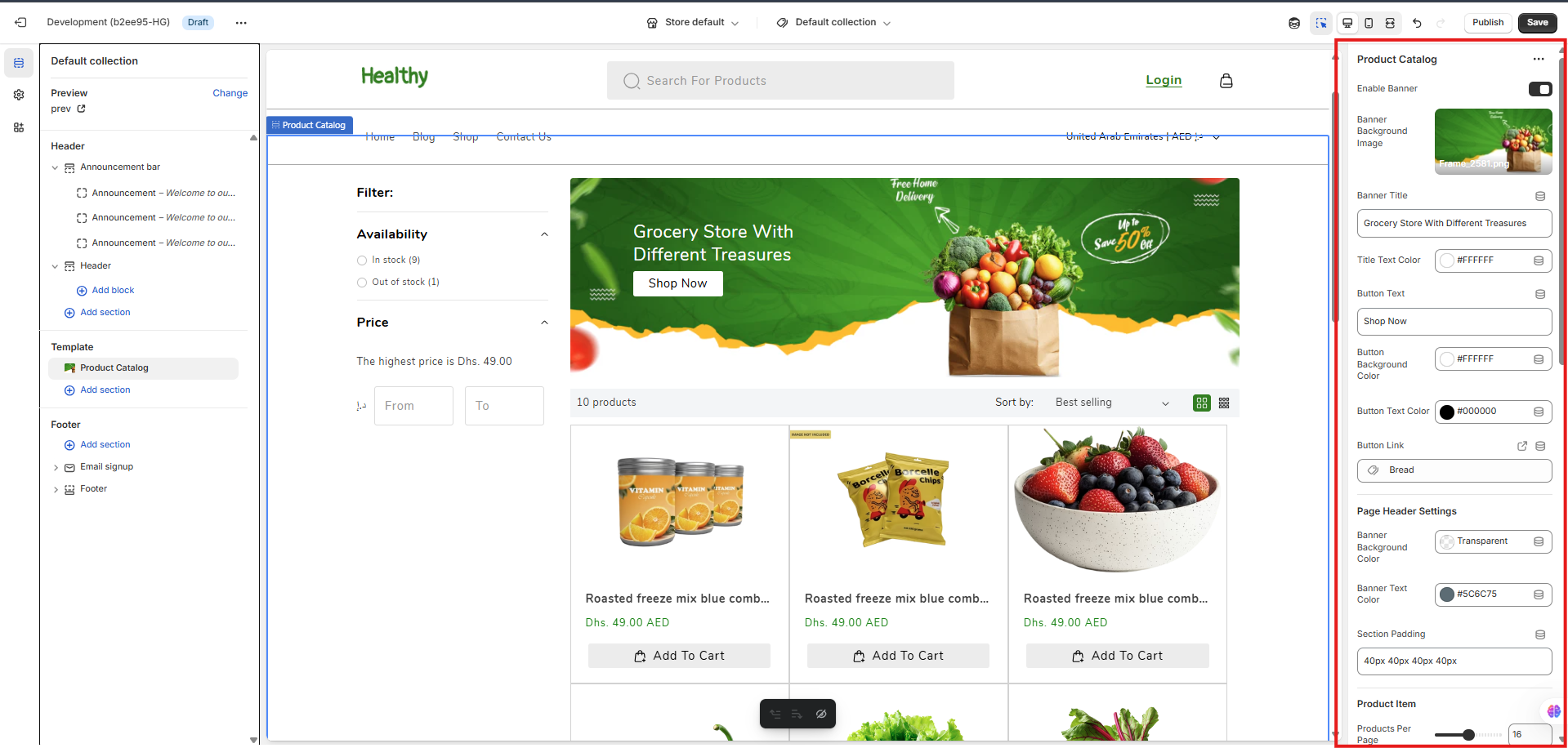
10 Collection Page
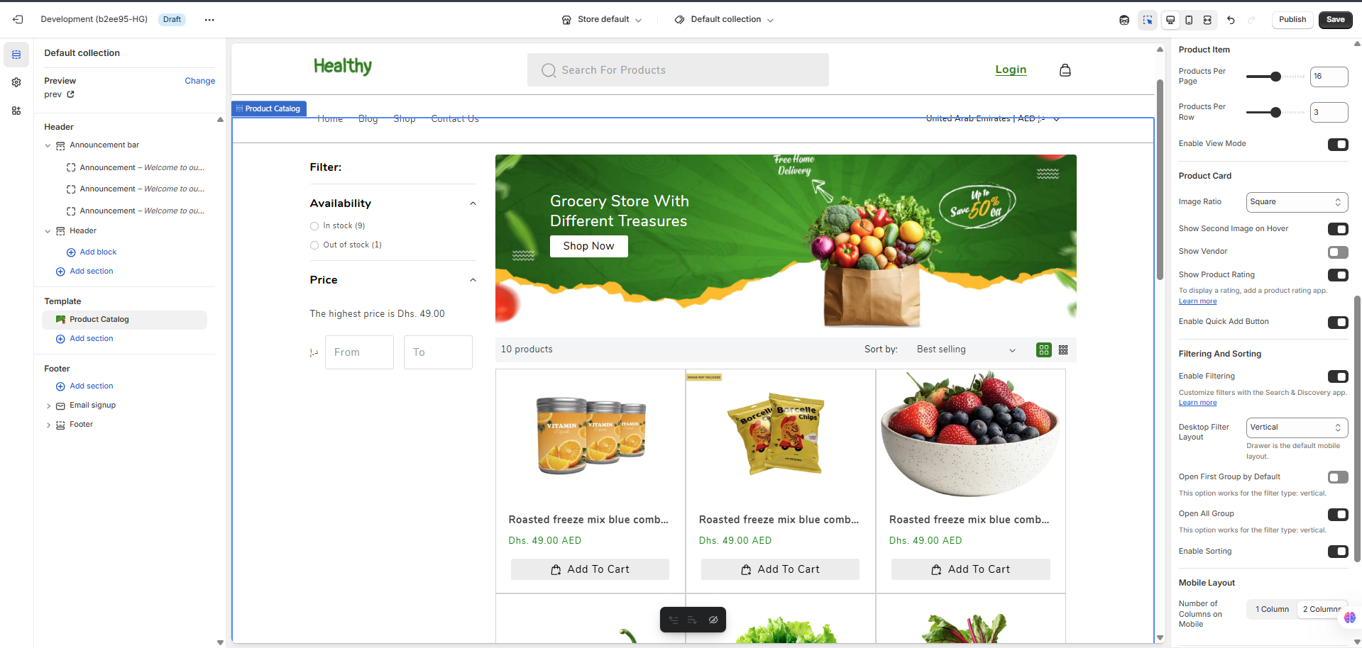
Step 1 : In the Theme Editor, go to the page selector at the top and choose Collections > Default collection to access the settings for your main product catalog page.
Step 2 : You can Enable Banner at the top of the page. In this section, you can set the Banner Background Image, Banner Title, and a Button with its own text, colors, and link.
Step 3 : Customize the header and spacing for the product grid section using Page Header Settings (to set a background and text color) and adjust the overall Section Padding.
Step 4 : Control the product grid by setting the number of Products Per Page and Products Per Row. You can also Enable View Mode to allow customers to switch between grid and list views.
Step 5 : Customize the individual product cards with options like Image Ratio, Show second Image on Hover, Show Vendor, Show Product Rating, and the Enable Quick Add Button.
Step 6 : Manage product discovery using the Filtering And Sorting options. You can Enable Filtering, set the Desktop Filter Layout (Vertical or Horizontal), and choose how filter groups expand. You can also Enable Sorting options for customers.
Step 7 : Finally, you can optimize the Mobile Layout by choosing the Number of Columns on Mobile (1 or 2 columns).
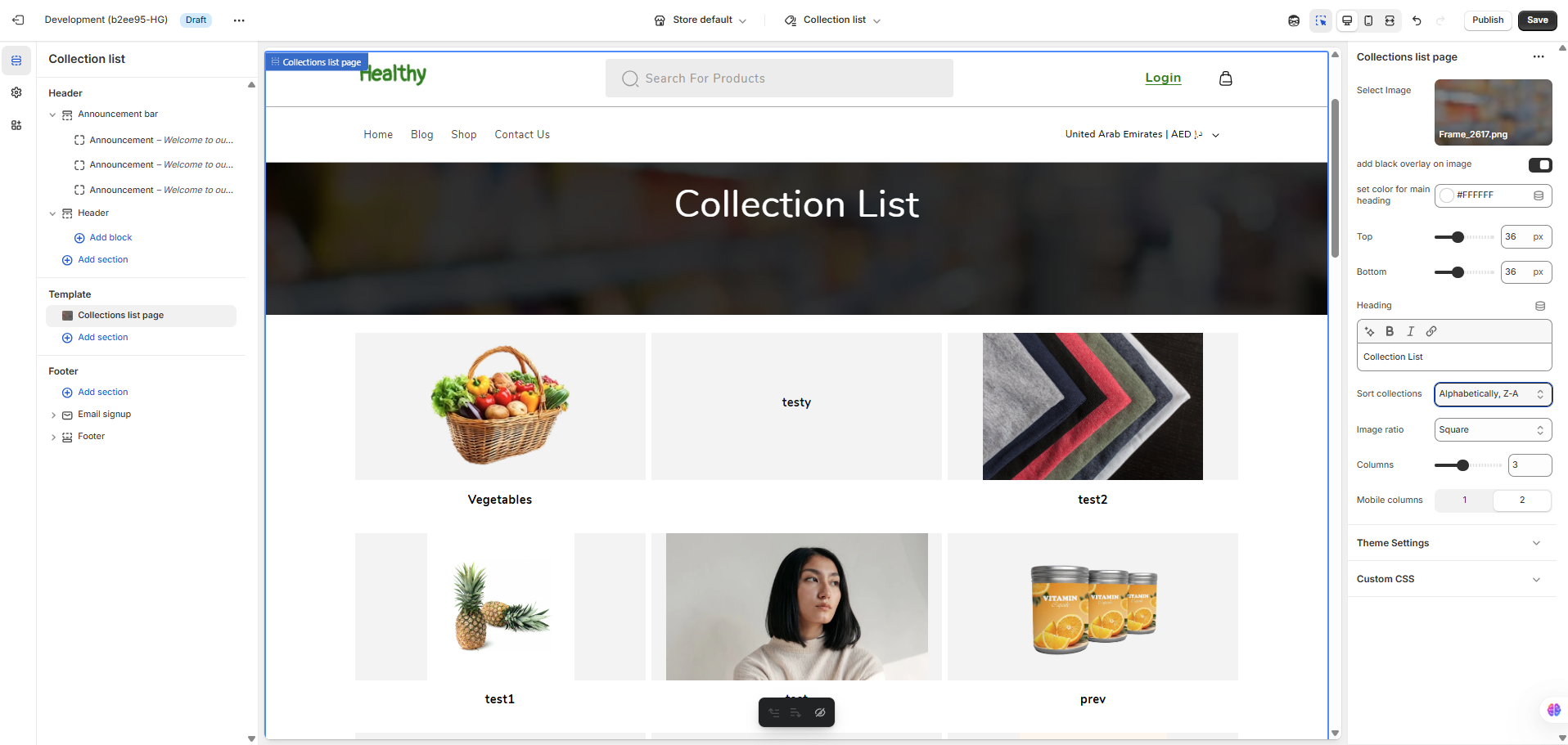
11Collections List
Step 1 : In the Theme Editor, go to the page selector at the top and choose Collections > List to view the collections list page template.
Step 2 : You can customize the page header by uploading a Select Image and enabling the add black overlay on image for better text readability.
Step 3 : Set the main page Heading text, its color, and adjust the Top & Bottom padding.
Step 4 : You can control the grid by setting the Sort collections order, Image ratio, number of Columns on desktop, and Mobile columns.
Step 5 : For advanced customization, you can expand the Theme Settings section to access global styles like colors and fonts, or add your own code in the Custom CSS field to apply unique styles specifically to this page.
12Blog Page
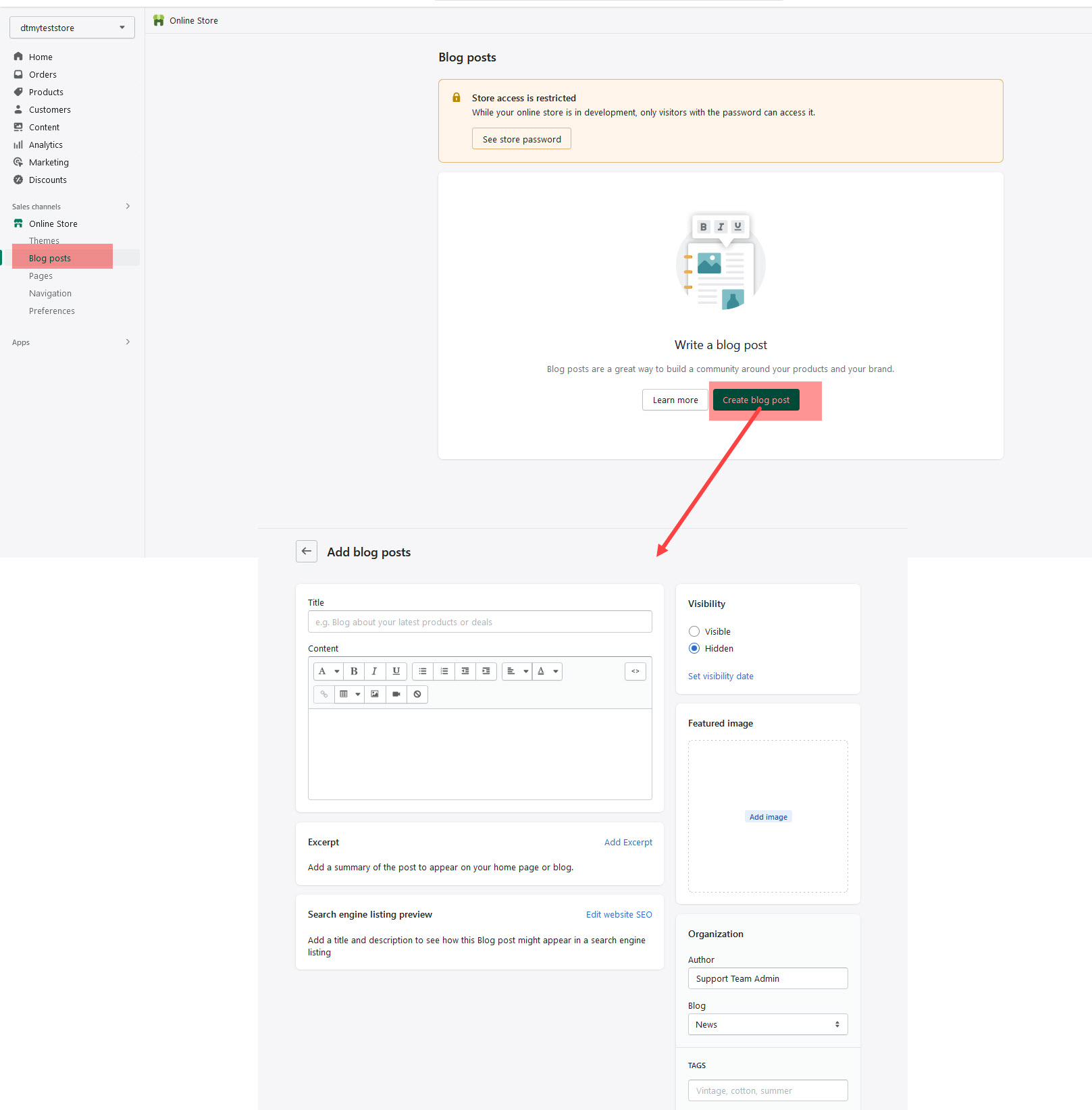
No matter which layout style you use to display your blog posts, the first thing you need to do is create the blog posts.
How To Create A Blog Post
Step 1 – Navigate to Blog Posts in your shopify admin sidebar.
Step 2 – Click on the Add blog post to make a new post. Create a title, and insert your post content in the editing field.
Step 4 – Add Tags from the right side. Type the name of the tag in the field, separate multiple tags with commas.
Step 5 – For a single image, click the Featured Image Box, select an image and click Save.
Step 6 – For a video post, paste the iFrame embed from either Youtube or Vimeo into the Video Embed Code field.
Step 7 – Once you are finished, click visible and save the post.
13Contact Page Section
The Contact Page section allows you to create a complete and interactive point of contact for your customers. It features a submission form alongside a dedicated area for your business location and contact details.
Section Settings Explained
Below is a detailed breakdown of every option available in the Contact Page section settings.
General Settings
-
Heading: This is the main title of the section. For example: "Contact Us" or "Get in Touch".
-
Sub-heading: A short line of text that appears directly below the main heading to provide more context. For example: "We are here to respond to all your requests".
-
Heading size: Controls the font size of the main title. You can typically choose between Small, Medium, or Large.
-
Color scheme: Applies a pre-defined set of colors (background and text) to the section. These schemes are configured in your main Theme Settings.
-
Set color for labels: This color picker controls the text color of the labels for the form fields (e.g., "Full Name", "Email Address", "Message").
Padding
-
Top / Bottom: These sliders control the amount of vertical empty space above (Top) and below (Bottom) the entire section, allowing you to adjust its spacing relative to other sections.
Button
-
Background color for button: Sets the background color of the "Send message" button.
-
Color for button: Sets the color of the text written inside the "Send message" button.
Map & Information
This group of settings controls the information box displayed next to the contact form.
-
Map link: Paste your Google Maps embed iframe link here to display a map of your location. If this field is left empty, the map will not be shown.
-
Enter your email: The business email address you want to display to your customers.
-
Enter your address: Your physical store or office address.
-
Enter your phone: The contact phone number for your business.
-
Enter background for map [information box]: Sets the background color for the entire information box that contains the map and your contact details.
-
Enter color for information: Sets the text color for all your contact details (email, address, and phone number) within the information box.
Helpful Resources
-
Where do I generate the Google Map iframe code?
15.1Multiple Currencies
You can enable multiple currencies by adding the countries and regions for each currency that you want to accept in your store.
Step 1 :In the Shopify Payments section, click Manage.
Step 2 :In the Countries/regions section, click Add country/region.
Step 3 :Select the country or region that you want to support from the list of supported countries and regions.
Step 4 :Click Add country/region.
15.2Add variants while you're creating a product
Step 1 : In the Options section of the Add product page, check This product has options, like size or color.
Step 2 : In Option name, enter a name for the option, for example Size. Customers see this name.
Step 3 : In Option values, enter each option value in a separate field, for example Small, Medium, Large. Customers see these option values when they choose a variant.
Step 4 :If your variants differ in more than one way, then click Add another option. You can have up to 3 options for each product.
Step 5 : As you add the product options, a list of variants appears. Uncheck the boxes next to any combination of options that you don't sell. You can also add prices, SKUs, and barcodes for individual variants, or use the defaults based on the product details.
Step 6 : Optional: Add a different product image for each variant.
Step 7 : Click Save.
15.3Create a Bundle product
Bundling products together is a great way to increase average order value and encourage customers to buy more from your shop. It’s also a great way to clear out inventory of older products or promote a new product launch. You can create bundles on Shopify without an app by following these simple steps:
Step 1 : Create a new product in your Shopify admin.
This will be the “parent” product for your bundle. Give it a name, description, and price.
Step 2 : Add a variant to this product for each of the products you want to include in the bundle. Make sure to set the inventory for each variant to 0 so that customers can’t purchase the products individually.
Step 3 : Create a new collection and call it something like “Bundles”.
Step 4 : Add the parent product to this collection.
Step 5 : Enable collection discounts. This can be done in your Shopify admin under Discounts (under Sales channels).
Create a new discount and choose “Collection” as the type. Then select the “Bundles” collection you created in step 3 above. Set the discount amount or percentage and save your changes.